Section 2
The Problem
25°C in Germany. A perfectly fine day. Open a weather app that uses colors, and the whole country looks like this:
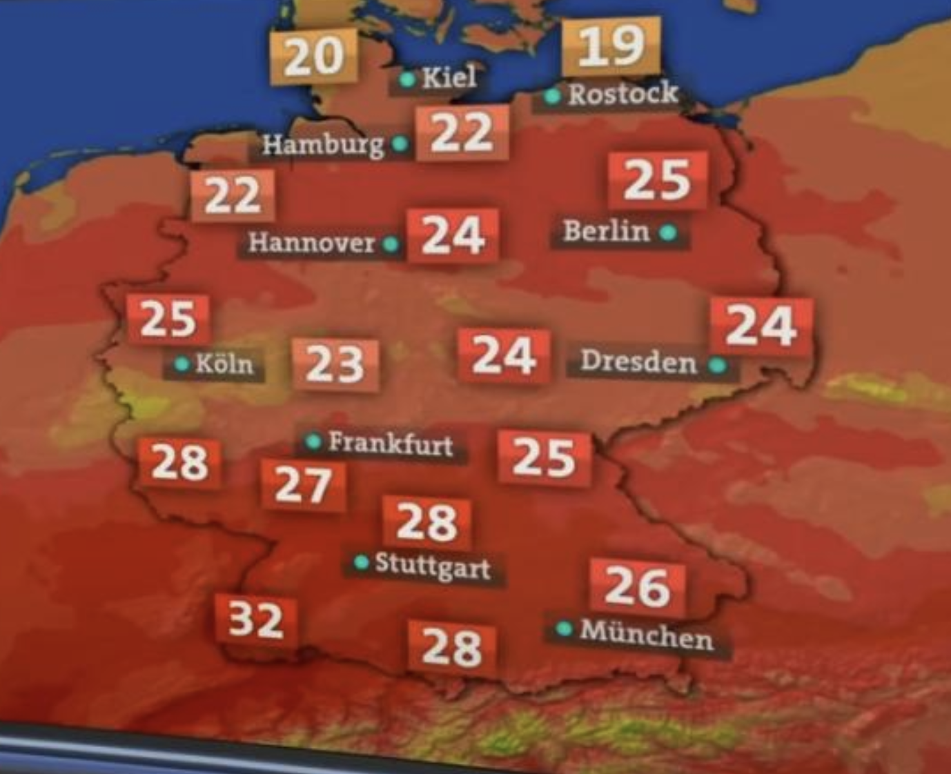
Colors on a map carry meaning. Red means danger. If you choose to use them, 25°C in red makes people panic at a beach day - and when 45°C actually arrives, the scale has nowhere left to go. Just show the numbers if you don't want to deal with this. But if you use colors, they should mean something.
Section 3 - Informative
Hall of Shame
These outlets made their choice, the wrong choice that is.
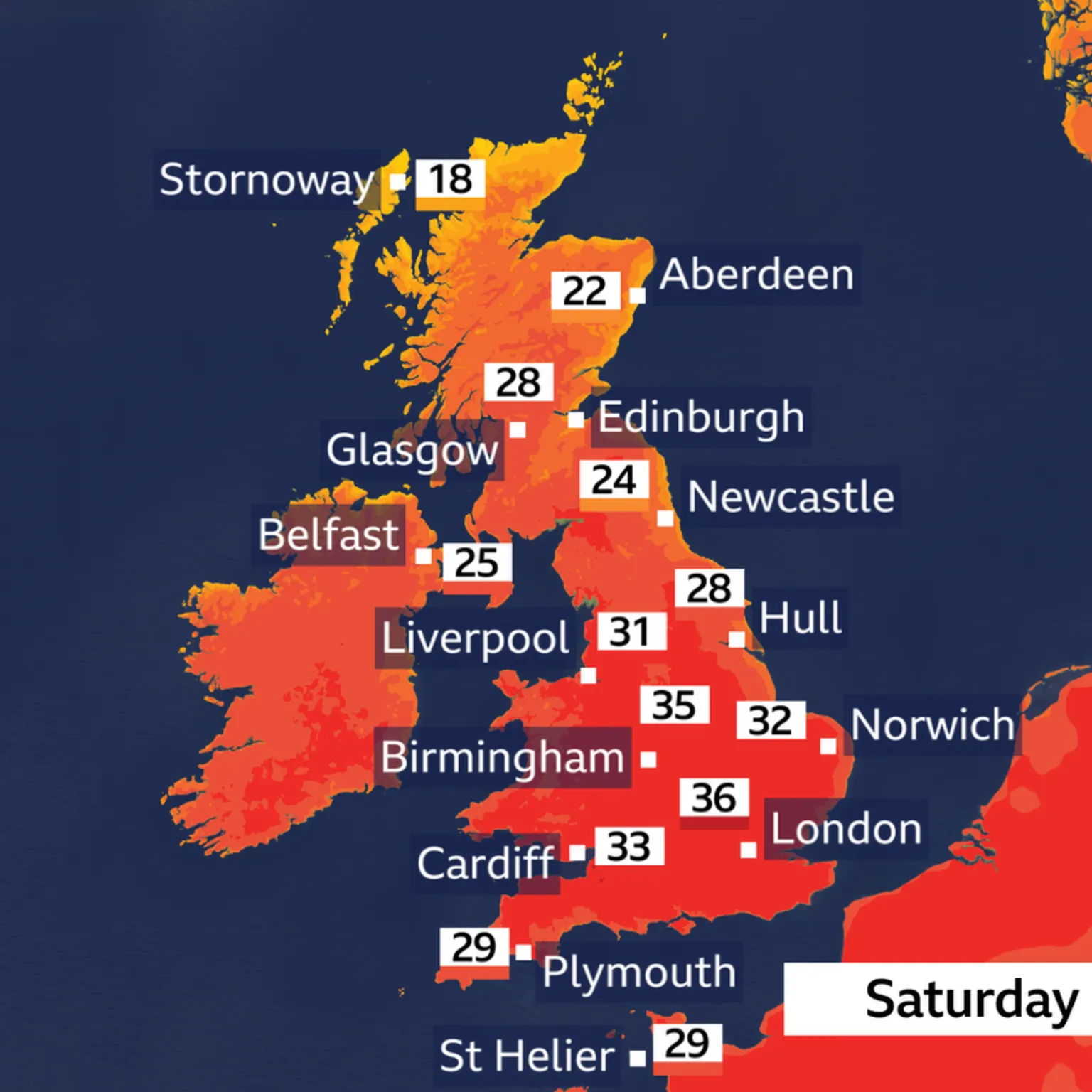
BBC Weather
SEVERE36°C shown in deep red. When called out, BBC News published a rebuttal: "Weather maps are alarmist" listed as Myth #1.
The Independent
SEVERE"Killer Cerberus heatwave sweeps Europe." Cerberus guards the entrance to the underworld. The entire map: red.
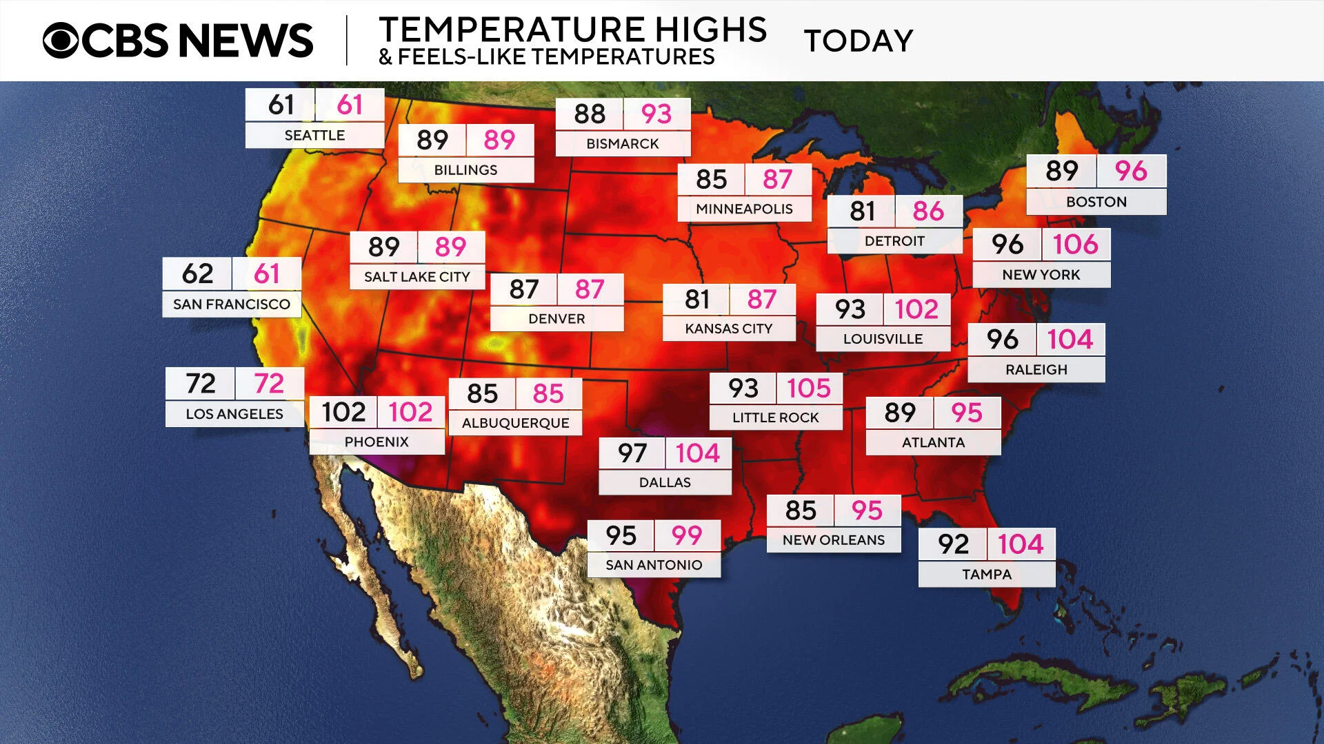
CBS News
SEVERERed starts at 61°F (16°C). That is a jacket day in most of the world. The scale communicates only one thing: panic.
Section 4
How to Cite This Standard
Next time someone shows you a color map with 25°C in red, send them here.
Recommended citation
For the normative reference, see:
temperature.guide"